♣ ♠ ♣ ♠ ♣ ♠ ♣ ♠

Goffs School.

A-Level media blog.


Magazines/Advertising.


Sunday, 9 May 2010

Questionaire Results.

When i created my blog, i had made a questionnaire, i did this so i could see what my target audience was interested in. In doing this, i found out what there likes and expectations are from a music magazine.
The questionnaire has helped me greatly, as it has allowed me to get feedback of what my audience thinks of my ideas and interests, also i could see what my target audience liked.
The questions i asked where simple, so i could just get a general idea.

The first and most important question, i think, was to ask what genre of music was most popular amongst my target audience, all the votes part from two went to Drum&Bass/Dubstep. This is good as this is what i wanted from my target audience, the other vote went to Indie/Rock, this is also good because some artist from this genre i have chosen to mention in my magazine. The over vote went to R&B/Pop, this genre of music would not fit into my magazine, although there is possibilities where it could meet the genre to be in my magazine.

The second question i had asked was if my target audience was male of female, these answers resulted in being pretty much equal, Female being 7 and male being 6, this is perfect because there is not a clear distinguish between the gender audience, this could show that my magazines target audience is equal and attracts both genders, making it more popular.

Another important question i had chose to use was what age are you? This would tell me that roughly what age my target audience, this gives me an advantage as i could find ways to appeal to their age group. The answers resulted in the majority being 17 to 18, two votes on 16 and another two on being 19+. This question results feedback was also good, and worked to an advantage for me, because the majority vote went towards older teenagers. I think this is positive feedback because of this age group, they are able to appeal to an more of an intellectual standard then what most younger teenagers would do.

Another question i had asked was what catches your eye most when buying a magazine. I asked this question so i could try put most of their inputs into my magazine. The majority of this vote went too images and then secondly the stories. I have tried to incorporate this into my work, and trying to put as many images on the pages i can, excluding the double page spread because i thought it would work best with just the one image. Also i have tried to make the stories most appealing and interesting, so it would attract the readers attention. I added stories to my contents page that i thought would appeal to all the readers, such as people that may be attending festivals, i had added a story about that. Also a story about bands, mainly boy bands i also added a story about them. I tried too appeal to all kind of ideas the reader my have, hoping that it would attract them to my magazine.

The next question i had asked was how often would you buy a music magazine? By asking this question i was able to see how important music magazines where to people. The results of this magazine where what i expected, the majority the voters had voted on 'Every now and then', this is because people only wish to know about music when it would appeal to them. Not like a normal magazine such as 'Heat' or 'Closer', this would appeal to some people the majority of the time.
The following question was to support the question previously, and it was how much would you spend on a music magazine? This answer would help me price my music magazine at a reasonable and fair cost, also one that would appeal to my target audience. The majority of the results was £3-4, this is a good result as this is what magazines would averagely cost. After i had this feedback i choose to price my magazine at £3.00, which according to my results is what would appeal to the audience the most.

As i found the contents page hardest to fill, i had decided to ask the question to keep you fascinated in a contents page, what would best attract you? By asking this question i was able to see what i could use. This question would also work out to my advantage as it allowed me to focus on three main things which according my results was, images, stories and bright colors. As i had all ready chose a color scheme i could not use bright colors, but i think red is a bright color, as it would stand out against white and black. I also had to focus on images, as that got the most votes, i had used three image, one big one and two little ones taking up a third of the bottom of the page. This would make the audience concentrate on the images, as well as the stories. The final focus which got the second amount votes was to focus on the stories, i had said before i would do this by appealing to all different views of my target audience.

Again, i had asked the same question as previously, but about the double page spread. This was also i could appeal to what the target audience would want the most. The majority of the vote was on a new artist this again would allow me to focus on one artist as it would appeal to my target audience. The second most popular answer was new festivals/raves, as this was not as popular as the artist i chose to use an artist for my main story, but i incorporated my second most popular answer which was about the festivals/raves. This would appeal to both audiences as it answers to both my popular answers.

Finally my last question was asked because i was indecisive about the name of my magazine. I had asked the audience what would name for a magazine would attract you the most?
This was so i could get a feedback on what name would be most effective to the readers.
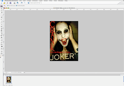
The most popular answer which i was most comfortable about, was having the name as 'Crank', this worked out for the best because the style of the name and the effect it gave the readers would all fit and tie in with my magazine.

Friday, 7 May 2010

Preliminary Task.


This is my preliminary task i had to do at the beginning of this course, it was to get a grasp on the feel of using the photosop and understand some elements of the photoshop, which would help us to produce our final media products.

As you can see it is very basic and had to be done over a short period of media studies lessons, so we then could move onto the real media production of our magazines. The quality shows a clear difference and proves how the amount of time has a major effect on the outcome.

Media Evaluation Questions.

7) Looking back at your preliminary task, what do you feel you have learnt in the progression from it, to the full product?


When i did my preliminary task it was so we could get a feel of using photo shop and was just to create a quick front cover and contents page, this task was only based on a couple of lessons, so it had to be done quickly, this included the photos being taken in school time so we could get them uploaded quickly and do the work on them. Comparing this to the real task we had a lot more time on the real media production and it is clear to see that, that extra time is needed to make it look good and professional.
Before we done our real media production we had analysed three different front pages, contents and double page spread all from three different magazines, this had a big advantage on the final production because this gave us ideas on what a real magazine looked like, so we was able to use the conventions to make our magazine look professional. When doing the preliminary task we had nothing to analyse but had to do the task on the spot, this made it harder to be more creative.
We also planned are own initial ideas so we could pick from these and hopefully compose a final idea, this helped a lot because when we came down to actually creating our final product we knew where to position everything and how it would go, this was a major help to producing my final product because it mad the process a lot quicker.
I had learnt alot doing this task, and alot came in handy to make my product it's best to it's full potentional, i had used the burn tool and the clone stamp alot, which i had just learnt while doing this corse, also i had learnt to blur and smudge images correctly to create a professional overlap, this makes the images look alot more professional. I also learnt that having a color scheme for my front page, contents and double page spread makes the magazine a lot more classier and professional. I wouldn't of learn this if i did not analyse any of the other magazine or if i had not done my preliminary task.


Media Evaluation Questions.

6) What have you learn about technologies from the process of constructing this product?

When i began to do this media production i used a new camera to take most of my photo's, so i could get the best quality. I used a Casio - Exlim, which is a 10.1 Mega Pixel, when taking this i discovered new features and zoom techniques which i could use to catch different angles of my models.

When using the photo shop, i had a basic idea as lucky enough, i studied GCSE media studies, this gave me a better advantage then others, because i had all ready grasped the basics from GCSE media studies. Also when i don't my preliminary task i was able to refresh my memory of the photo shop application and use other features. But when doing this project i learnt new things such as the burn tool, to create a darker image and show a contrast, also i found the clone stamp tool very use full as all my photo's had the date in the bottom left corner of every image, so i had to remove them by doing this simple process.

Another feature i have learnt to use when doing this project is the blogspot.com website, by using this i was able to keep track of all off my work, and keep it in it's right places. Also having the blog had it's plus sides because of the not having the need to keep a folder in a clean and neat order. But, a disadvantage to the blog would have been the fact that if your Internet was down or you had a poor connection then you were un-able to keep on your blog work.

The process of this production was very long, but i think was worth it as the end result is what i wanted and i am happy with.

Media Evaluation Questions.


5) How did you attack/address your audience?

After analyzing the other magazines i saw conventions that would appeal to a certain type of audience so i tried to add them to my media products to see if it would work.
I used a male model and a female model to attract both girl teenagers and male teenagers so they would be attracted to them or idolize them for there person. Also the clothing on the models is indie kind of style, this could lead the readers to either dress like them, or assume that their kind of music would be the indie/rock. Also the poses that th
e models are doing especially the 'Joker', they are intimidating poses therefor it would suit my teenage audience because thats the stereotypical view of teenagers for them to be intimidating. 
As well most celebrities are on the front cover for major music magazines, in  theory if my magazine was a real magazine this would be a celebrity on the front page. But i have used a part on my front page called 'Band Index', on this i have mentioned real famous people in which this is like celebrity endorsement, by doing this the audience will see these artists and 
will be intrigued to see why they are featured. 
Also i have used a lot of rhetorical questions featured in my magazine to make the readers more interested in the text, also on my double page spread i have used quotes to address the audience by using these techniques the audience will want to know. Also i have used large well known names for festivals which a lot of people attend, such as Reading and Glastonbury. 

Media Evaluation Questions.

4) Who would be the audience for your media product?

The audience for my media product would be an indie type person, who shows a different kind of fashion.
Instead of just the stereotypical fashion of an indie person, they would be slightly more different.
I discussed this in my earl yer post on my blog, saying how the person would like attending festivals and being in with a crowd, would enjoy loud music and the endowment around them.
They would like tattoo's and different fashion type to what most indie/rock people would.

Here is a range of people that would suit the category...


Media Evaluation Questions.

3. What kind of media instituion might distrubute your media proudcut and why?


Development Hell Ltd are the publishers of the mixmag magazine, when it launched in 1982, It is the market leader and has maintained its reputation as the most influential title in the dance sector. It created the words "superclub" and "trip hop", released the first legal DJ mix tapes and CDs and is the most trusted voice in dance music. Mixmag produce dance and club music which under this magazine my music genre appears, i know this because when analyzing the magazine some of the bands i have featured have been mentioned in mixmag magazine too.

IPC Media are the publishers of NME (formerly International Publishing Company UK Ltd) is one of the United Kingdom's leading consumer magazine and digital publishers, with a large portfolio selling over 350 million copies each year. It was formed as International Publishing Company UK in 1963 from the amalgamation of the holdings of three companies: the British division of the original IPC(International Publishing Company J-M Ltd. which still operates under this name in Jerusalem, Paris and New York), George Newnes, Odhams Press and Fleetway Publications. This magazine produces the same sort of music i did like but not the same, it does feature some artists that are good candidates for my magazine but not all of them.


Overall i think development Hell Ltd would be the idle publisher for me because i think they produce the same kind of music for my media product and also they have the same idea of music that they want to publish.

Media Evaluation Questions.

2. How does your media priduct represent praticular social groups?

My media product does represent a inidie style of people, because of the clothes the models are wearing in my magazine and because of the type of festivals that are named such as Reading, which is known for it's indie/rock magazine.
All though my magazine is targeted at people who like Dubstep/Drum&Bass, these people are commonly indie/rock styled people. So when using my models i made sure that they were dressed in a indie fashion, for example the 'Joker' in my magazine, allthough you may not see her face, you can see a denim jacket with zipped leather rockish boots, these are commnony seen in the inidie/rock chick fashion. Also by the lettering throughout my media products it sticks to that gothic feel writing, once again this represents a rock look to the magazine.
By having the Joker model with face paint it adds to the whole mystery of the Joker, so it attracts both woman and male teenage audience. Also as the Joker is a female we see that she is a strong and different female which would attract female attention because they would idolise her and her work. The color sheme of the front page is quite dull and black, this would attract male teenage because of the dark and black colors, where as if i was too attract a female teenage audience i would use girly colors such as pink and purple.
My models are white, allthough you can not see the Jokers face, we still know that she is white. White models are more stereotypically seen in inidie magazines when black people are more commonly seen in R&B magazines.

Media Evaluation Questions.

1. In what ways does your media product use develop or challenge forms and conventions of real media product?

When i first began to create my media products, i decided to analyse 3 other magazine's front page, contents page and double-page spread. By doing this i was able to use some ideas and have a basic knowledge of where i would begin constructing my pages.

Front Page.
When doing my front page i analysed the other music magazines front pages such as Q, NME and MixMag, when doing this Q and NME both used the same convention of one main artist/band on the front cover. This is what i decided to by using one main artist it would put the main focus on them. My front page is similar to the Q front cover, i chose this idea because having just the one main artist on the page i think is more effective for the reader because there is less to concentrate on and they know what is to be featured inside the magazine. I challenged the convention here because instead of using a long shot shot photo for the image, i used a close-up. I chose to use the close up because out off all the photo's i thought this photo would of been the most effective because of the good i contact from the artist and also the intimating look, and the dark colors makes us focus more on her pale face.
Other conventions i stuck to having were, a puff, the bar code in the corners of the page and in most other magazines we see the text is at the bottom below the image, i decide to follow these conventions because the space was suitable and they would fit perfect. Also having the text at the bottom creates a main focus too, and the bar code in the top right corner is out of the way and un-able to see.
I used text on the side of the page which is seen on other music magazines, but i had developed that convention a little further by adding a bit more text and forming a 'Band Index', but instead of just having it in a boring white box, it would not fit in with the theme of my front page, so i decide to add black slashed lines to put more detail into the 'Rough and edgy' look.
Another convention i decide to challenge because i thought it would have more of an effect on the audience as every other music magazine follows this. It was to place the title of my magazine down the left hand side of the magazine, i decided that this would be suitable for the name of my magazine, as it was a long name that i would be best suited down the left side. As i trusted my own instinct to do this, i think it worked well and having the title of the magazine and is very effective because it allows more room to focus on the main image.


Contents Page
For my contents page i followed the simple convention of having a color scheme involved in all of my media products. The continuity of my color scheme is done throughout all the pages, this would be done in real music magazines, for example Q follows the red, white and black them throughout all of the pages.
Another convention i followed is the use of other images, on my contents page i used other images on the page, i choose to use this because it then shows the readers of the magazine what else is inside the magazine and makes them more intrigued to find out about these images. I used the idea from contents page i analysed on mixmag, but just developed some of the conventions further by using other conventions of other music magazines. For example on the mixmag contents the text of the stories that will be featured is boring, but i used the idea of having a black bar and adding white text over the top for titles which is what you see most commonly in other magazines.

In most contents on music magazines, wee see just block color backgrounds which i choose to use in following this convention, by having this it allows the audience to focus on the images and all the text with out things being to complicated as it would of been with a patterned background.


Double page Spread
After analysing three different double page spreads i was able to see the conventions of what a double page spread would consist of having.
On all double page spread, they have a page number and a website so you can look up the story and see it for yourself, i have added these to my double page spread. Also before the main story of the text, we have a little introduction to see what the story is about. Another one is that again i have followed a color scheme of the red, white and black throughout all of my media products.
Another convention would be the size of my image, when looking at the other magazines, most of the images where large where you could see the whole of the artist in the picture, i have done this but have adapted to this convention because of the angle of the camera, i have positioned it diagonally when most images are straight on the artists/band. Also having the image onto one side and the text on the oposite is very conventional too. Also another convention we see in any kind of magazine, especially music, is when you have a quote in large writing in the middle of the text, this makes it stand out and would be the first thing that the readers would look at, "It will be the same as last time, but better! It's a comeback isn't it?" This is a little preview of what the interview is about and automatically draws in the reader, this is something you would see everywhere in any kind of magazine and is populary used.
I used some of my ideas from the NME double page spread i chose to anayse as i thought it would be more helpfull, but then i adapted some conventions like the masterhead also, the postion of objects like the other images on the page.
I think for my double page spread i followed all of the conventions for it, as i thought it would be the most complex one of the three because of the images and text and positioning. In doing so i think my final product looks smart, realistic and professional.

Thursday, 6 May 2010

Steps for Double Page Spread - 3.


I then added little images in the top right corner, this is too fill the space and add more detail and not so plain then just lots of text as this would bore the readers.
After this i added the page details and the website of my magazine, as extra details that is conventional in a real music magazine.
After looking at it a little more, i then decided to add the photo of 'Paddy' and some text to make the main image pop and a little bit more color.

Steps for Double Page Spread -2


I then added the title of the story at the top in a slant to make it more different and give it the 'edgy' look. I added more text after and made an interview with the joker.
I still kept the green line so i could keep focus on where my text would be and not into the fold.
I also used the burn tool around the text so it would have that contrast effect still around it. 

Steps for Double Page Spread -1


I started of with the page blank and added a green line, so it stood out as the half way mark, this is so i could make everything even even and nothing on the green line.
The green line stands for where the magazine would fold in the middle and it would prevent having any of my text in the middle or any of my images.
I then added the main image that took up the left side of the page i used the burn tool, too make the left side of the picture fade in more and have a white to black contrast. 

Stages of Contents Page - 3


After adding all the images i needed, i then knew how much room i would need so i could then add the text.
When i started writing, i added conventional headers from other magazines i added, by adding a black background then putting white text over the top. After doing this i then added all the text i would need for my contents about what will be featured in the magazine, and for my double page spread. After that i noticed a bit of space that was below the date and titles of the page, so i added more lines that where slanted and crossed over each-other to take up more room and give a more 'Harder' appeal. 

Stages of Contents Page - 2


I then added two more images that would have spaces to fill and these images would be apart of stories that would of featured in my magazine.
I also put a border around the image in the bottom right corner of the festival, this gives the same effect it would of done for the main image, i tried to put a border around the bottom left corner but it had  to many different images awkward  bits on it, i decided to leave it, and put text above it.
I also added a date and title of the page in the left corner and the title of the magazine. I put a black underneath to separate it from the other text that will come below it. 

Stages of Contents page - 1


I chose to use a white background and used black lines to create a border so it made it more unique and the text and images on the front page stand out more.
i then added the picture of another feature that will be in my magazine and it features on the double page spread.  I then put messy/slanted borders around it so it would look more private and stand out more, and then added the title in red to follow the color scheme of the front page of the red and black. Also using the red font makes it stand out more. 

Tuesday, 4 May 2010

Steps for Front Cover - 4


After i thought i was done, i then i realized needed to add the barcode and magazine and the price. 

Steps for Front Cover - 3

I then added lines to create more of an effect for when i put the band index on the right side. Then inserted the names of the band that i wanted to feature on the inside of the magazine. By having these lines it makes it less boring and adds more of an effect to the dark effect.


When i added this and finished off everything, it still looked plain so i decided too add a puff, to make my magazine to make it more exclusive and unique, my puff says '"The ONLY Dubstep/Drum&Bass Magazine".
This makes my magazine stand out more to readers and more noticeable.

Steps for Front Cover - 2


I added the title of the magazine down the left side of the page, and made it shorter so the title of the story would stand out the most. This was so the audience would then focus on the masthead of the story and it would become the main feature.


Steps for Front Page - 1


When doing the front page i used a main image for the whole background, because in the photo she has good eye contact so it's more direct for the audience.
Also by having this image as the background makes it more effective and the readers then know that this person in the picture is important and is the main story that would feature on my double page spread.
I got the image and stretch it by clicking the chain tool in the top left corner in the toolbar, this would lock the pre-portions, so it would stretch more clearly and not cause the image to blur or become fuzzy.

Sunday, 28 March 2010

Contents Ideal Photo's.

As i did for the front page i took a lot of photos then only chose a few to be edited, and then i would narrow it down to choose the final one for my one of the images on my contents page.


This image is one of the photos i choose from the many that i took, i thought this photo was a bit different and a more indie looking. I then edited by turning the image black and white and using the croping tool to just get him in the photo. I thought this would make a good photo because of the way he is standing with the little flame makes it more different and a bit quirky. But after editing a few more of the other photos i choose, i decided that this image was a bit boring with the black and white and did not look as good as the others, so i decided not to use this one.


This is another image i choose from the all the others and edited. I edited this by increading the brightness and then increasing the contrast, so it made all the color in that photo be a bit louder and brigter. I then cropped this image so i wouldnt have the curtain or the wadrobe in the image. This image i liked because of the way it turned out after editing it, with the colors being brighter and louder, i also liked it because it had the gutair in it, which actually makes him look like a muscian. But after i decided not to use this because of the gutair, it makes him look more like an indie boy instead of a Dj, that would make Dubstep and Drum&Bass music. Also it is too typical to have a gutair as a prop, as most muscian in magazines always tend to have a gutair or drums.
Instead of using this image for the contents, i have decided to use it on my double page spread this will make the readers more intrested to see a different artist on the double page spread, will appeal more to the readers, and also with the bright colors on the dark background it will make the picture 'pop' more.


This was another photo i choose amongst the others. I edited it by increasing the brightness and then increasing the temperture. When i fist took this photo, i thought it would look a bit different and edgy because of the dead rose, and all the rose petals that were picked and scatterd everywhere over him. But after i edited it and cropped it, i relised it wernt actually that good because you couldnt really see the petals because of the dark denim. Also when i had edited it, it did not have the same effect as some of the other photos did, espcally the one i have choosen for my final.